Retail space NEG
Type: Retail space
When: 2021-2022
Team: Kate Turbina, Olga Nikonova. Alexander Nikulshin. Project management: Aurora Group, Hyperion, Alexandr Morozov, Kristina Parshina
3d: Aurora Group
Gallery
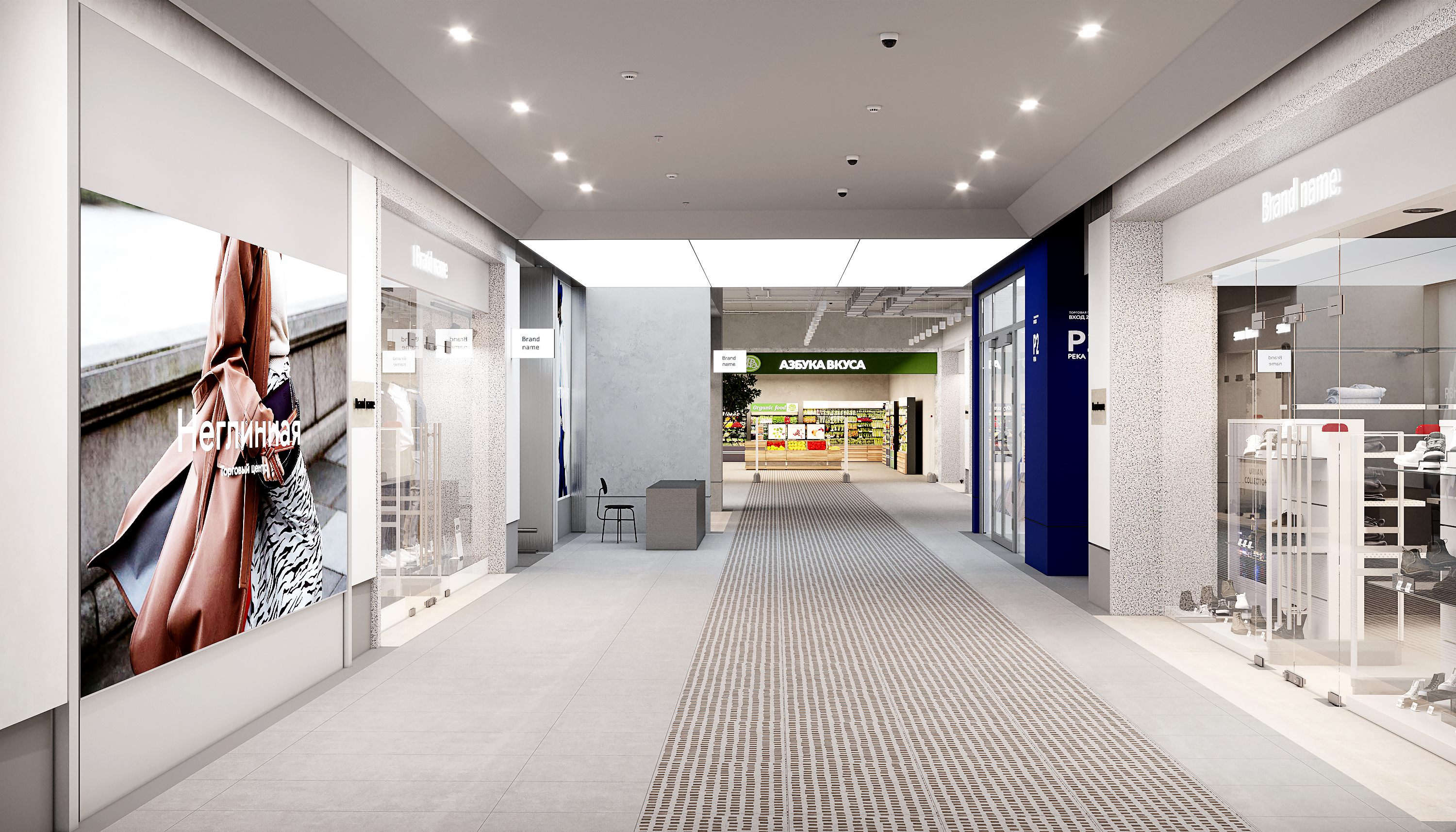
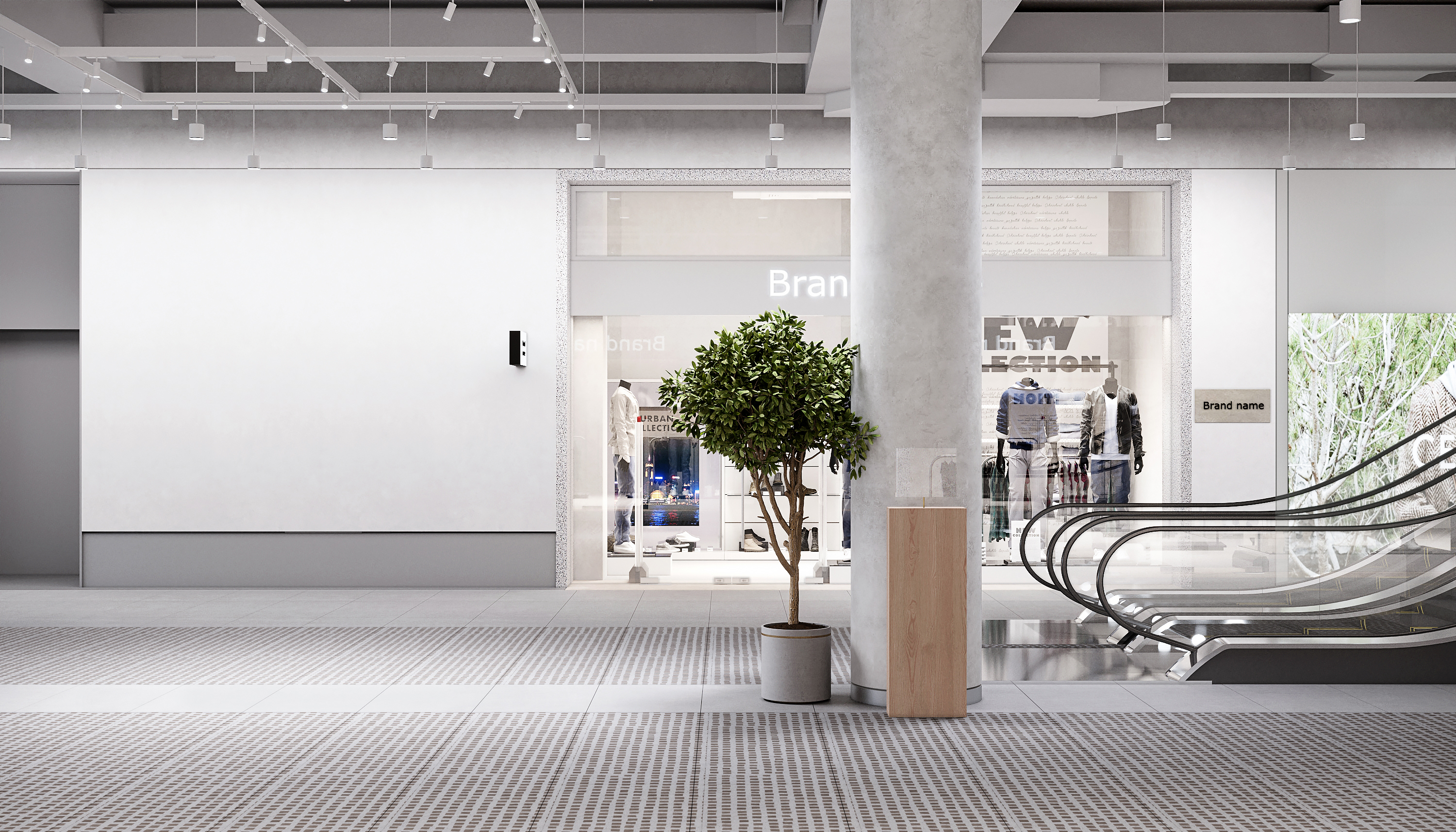
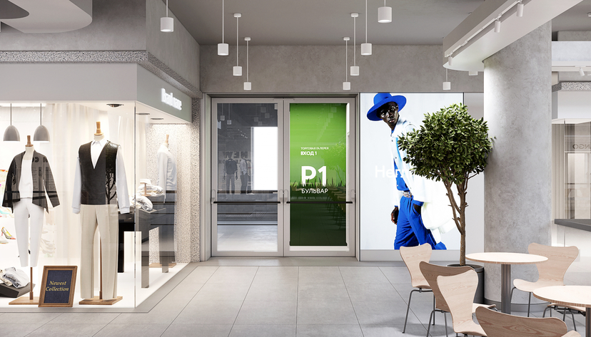
Neglinnaya Galley is one of the most popular and fancy shopping malls in Moscow, Russia. I was honoured to work on the mall renovation in 2021-22. I started my work from researching about historical facts, context architecture and future trends. The main idea of the project was “when old meets new”.
In 2020 I wrote an article about Narkomfin structure where I mentioned the importance of a historical renovation and the attention to the details. In this project we were challenged to rethink traditional geometry and design a new approach combining trends, customer’s demand and functionality.
Lift hall
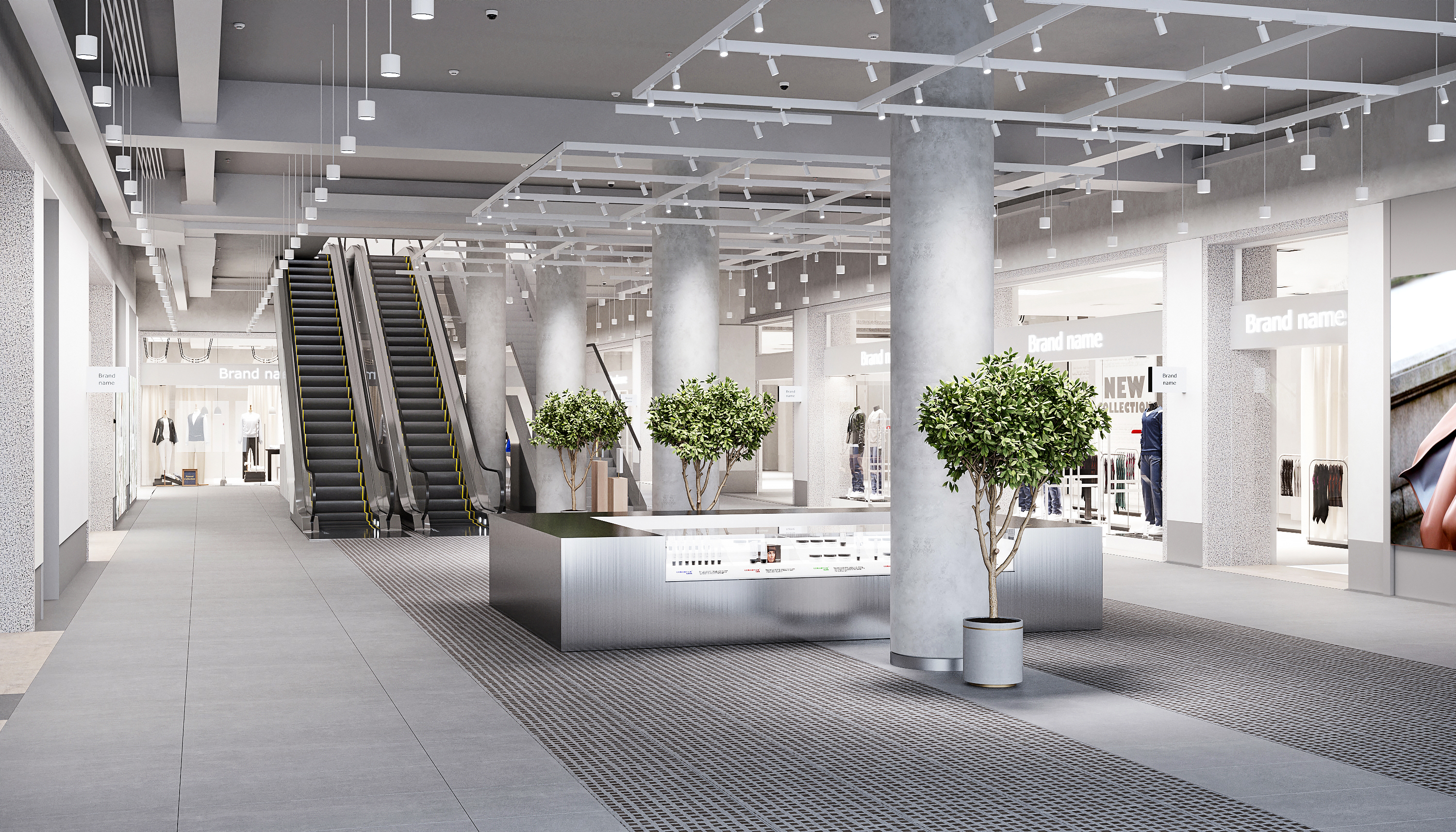
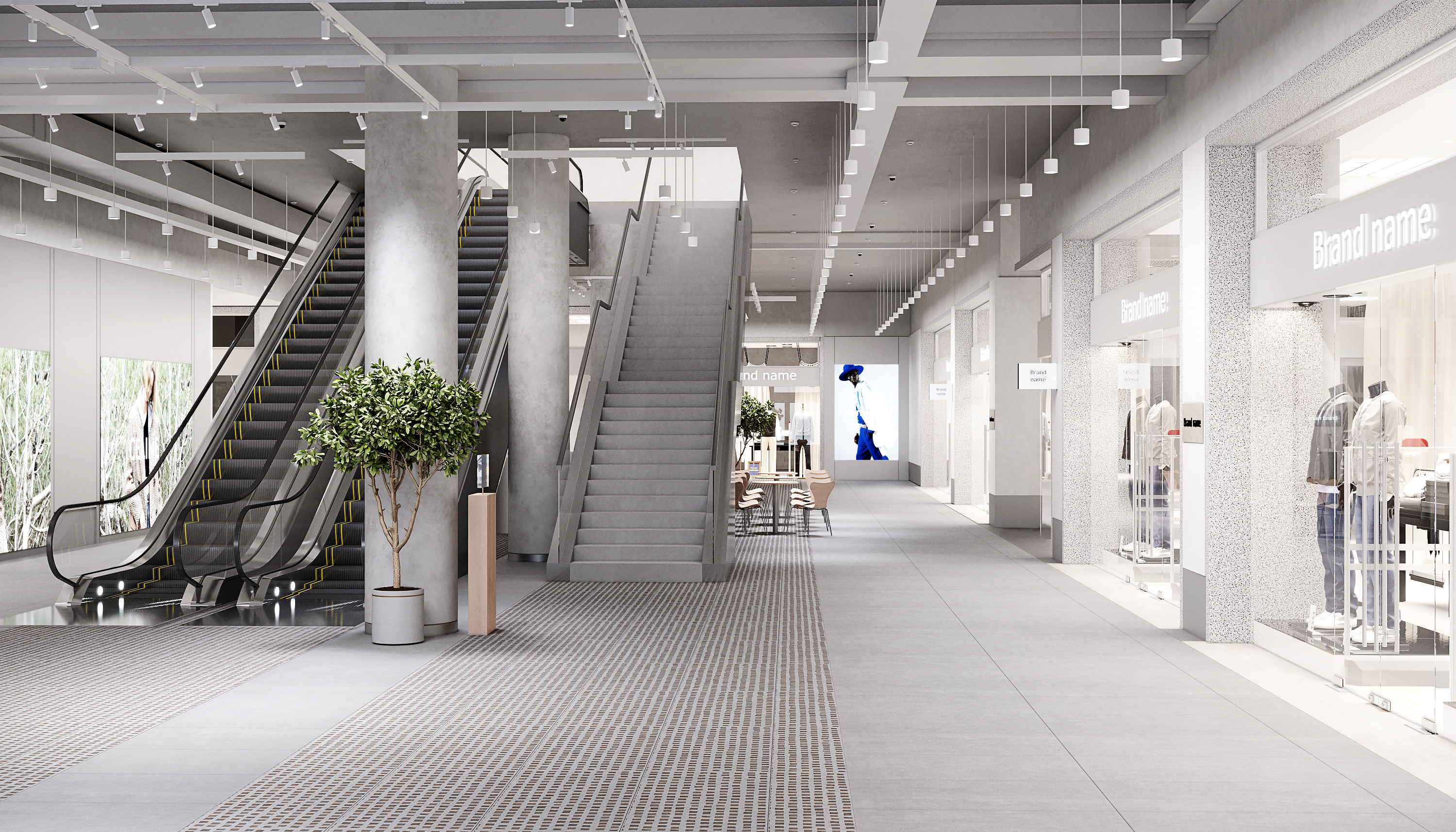
Spacious halls
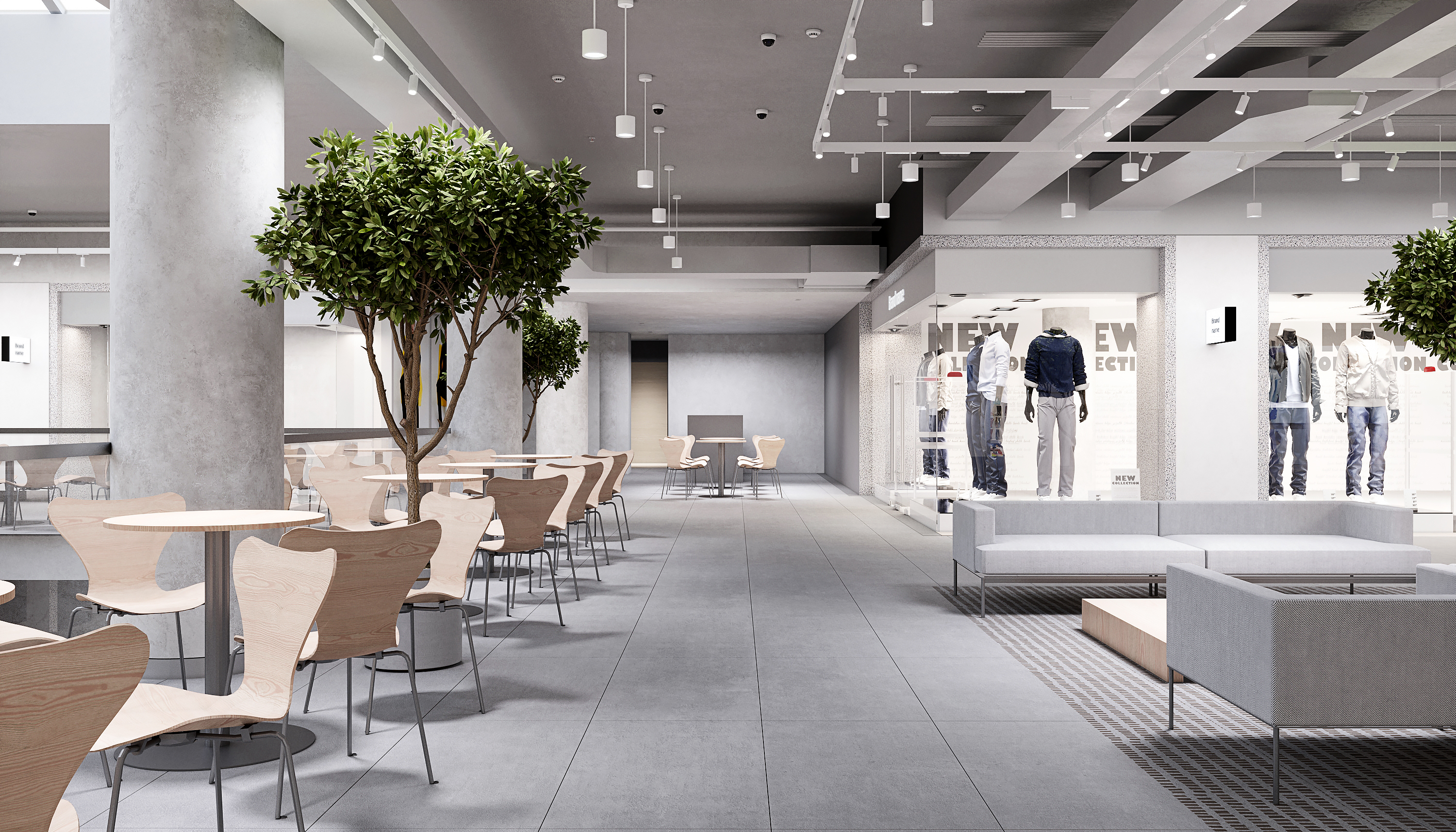
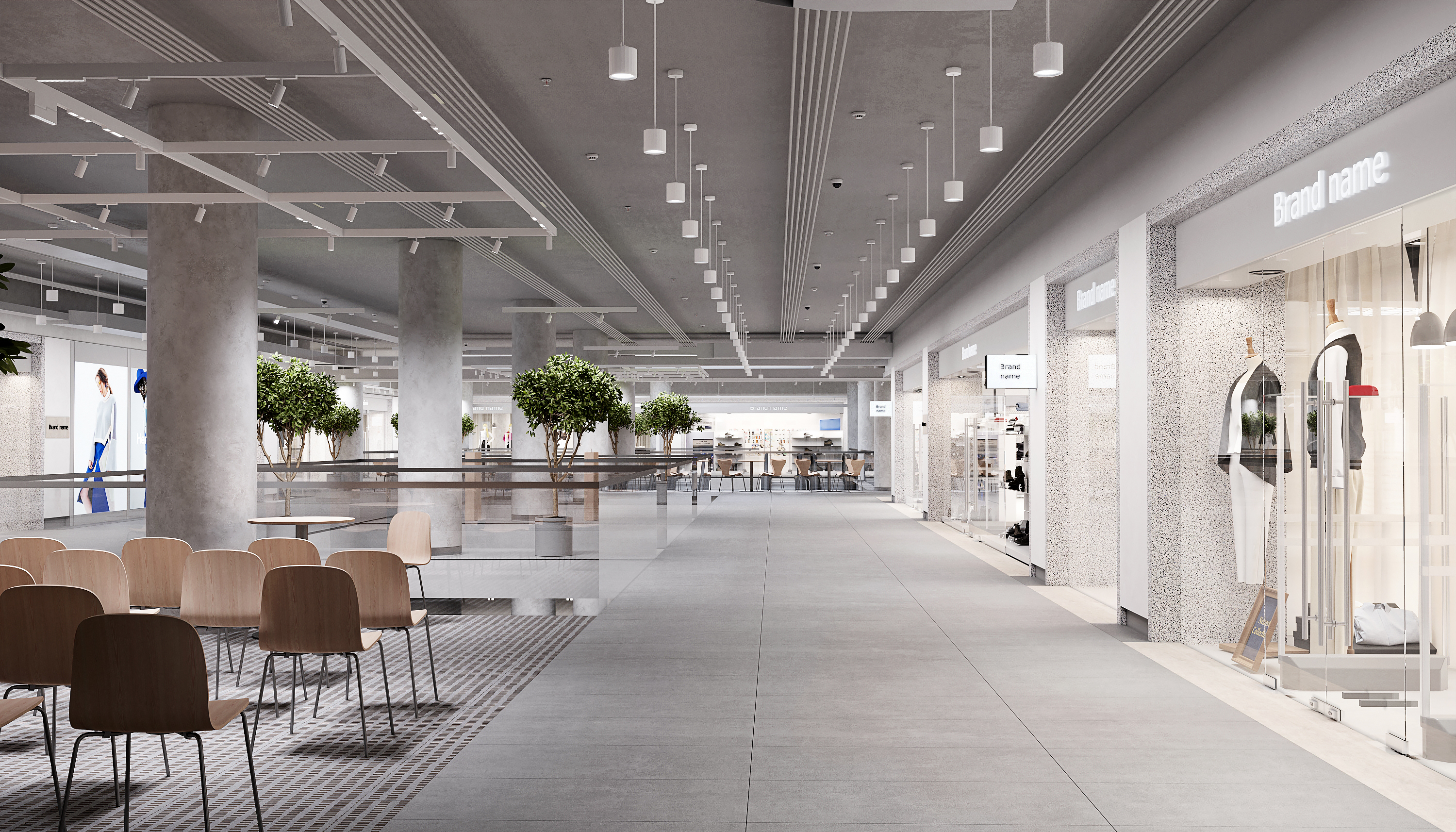
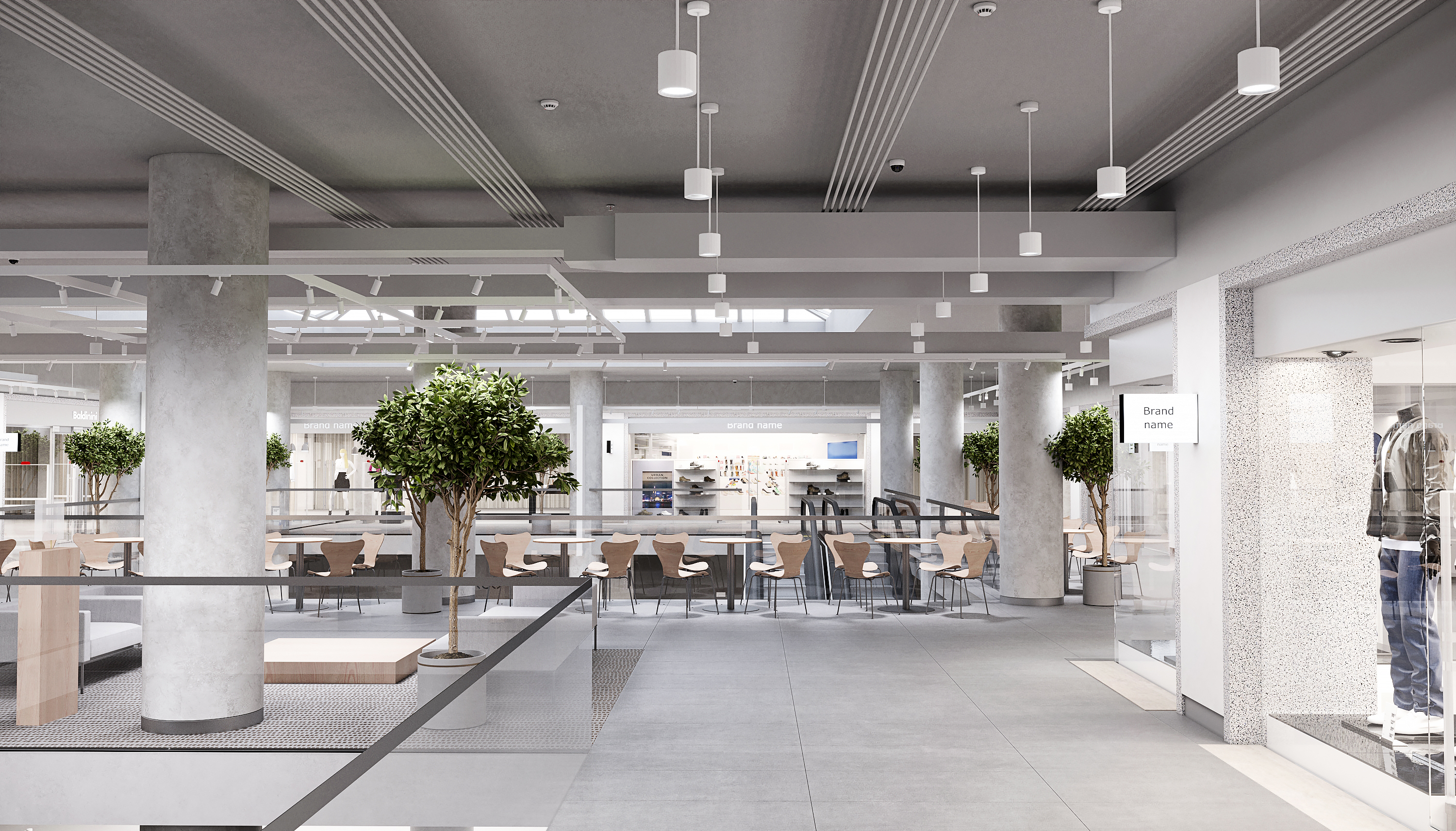
According to the research the shopping mall area is in a historical centre of Moscow which was called White City in old times. My concept suggested a creation of a new city based on the history and spirit of the ancient site. The Neglinnaya Gallery is surrounded by mansions, cathedrals, museums and theatres. This fact influences the functionality and materials. The concept of a building underlines a contrast between the history and dynamics of a modern city. The main task is to create a neutral (blank/minimalistic) but graphic design language for common areas through architecture and lighting to be filled with appropriate scenarios.
Spacious halls
The mall has its own infrastructure: shopping areas, fitness club, boutiques, offices, restaurants, cafeteria. The gallery becomes a new point of attraction in the city through events, exhibitions and lectures. It is re-developed to become a hybrid Life&Balance space with different functions (Mixed use project/multiple use). We added more areas for various purposes: chill-out spaces, meeting points, venues, pop-up and photo-zones and cafeterias. A comfortable place to be, to achieve balance and to be easily integrated in your daily routine.
Modern approach to space organization.
These examples show how the idea of a shopping mall has been adapted to accommodate new functions.
In Beijin shopping mall there is an example of a brand activation in a public area of a mall, that’s possible when the space allow to integrate something new.
In the multifunctional complex called Morland Mixité Capitale we see how important to combine different functions at one place and keep the space blank.
FrameWeb provides the resume of Hyundai shopping mall center for the shopping malls how to survive in difficult economical situation.
The interior is created for a dynamic professionals with a demand for aesthetics.
Th proportions are agreed with the historical context and the materials are taken from a modern world, creating a new unique combination for brands representation.
The creative structure has been designed for contemporary brands, allowing them to seamlessly integrate their occupants into the space and highlight their uniqueness through a neutral base.
I was inspired by famous malls like Burdifilek Hyundai Seoul Shopping Centre, Shanghai Jiuguang Centre, CANBERRA'S RETAIL space, Australia, CHONGQING – A shopping mall in Chongqing, China.
Wayfinding
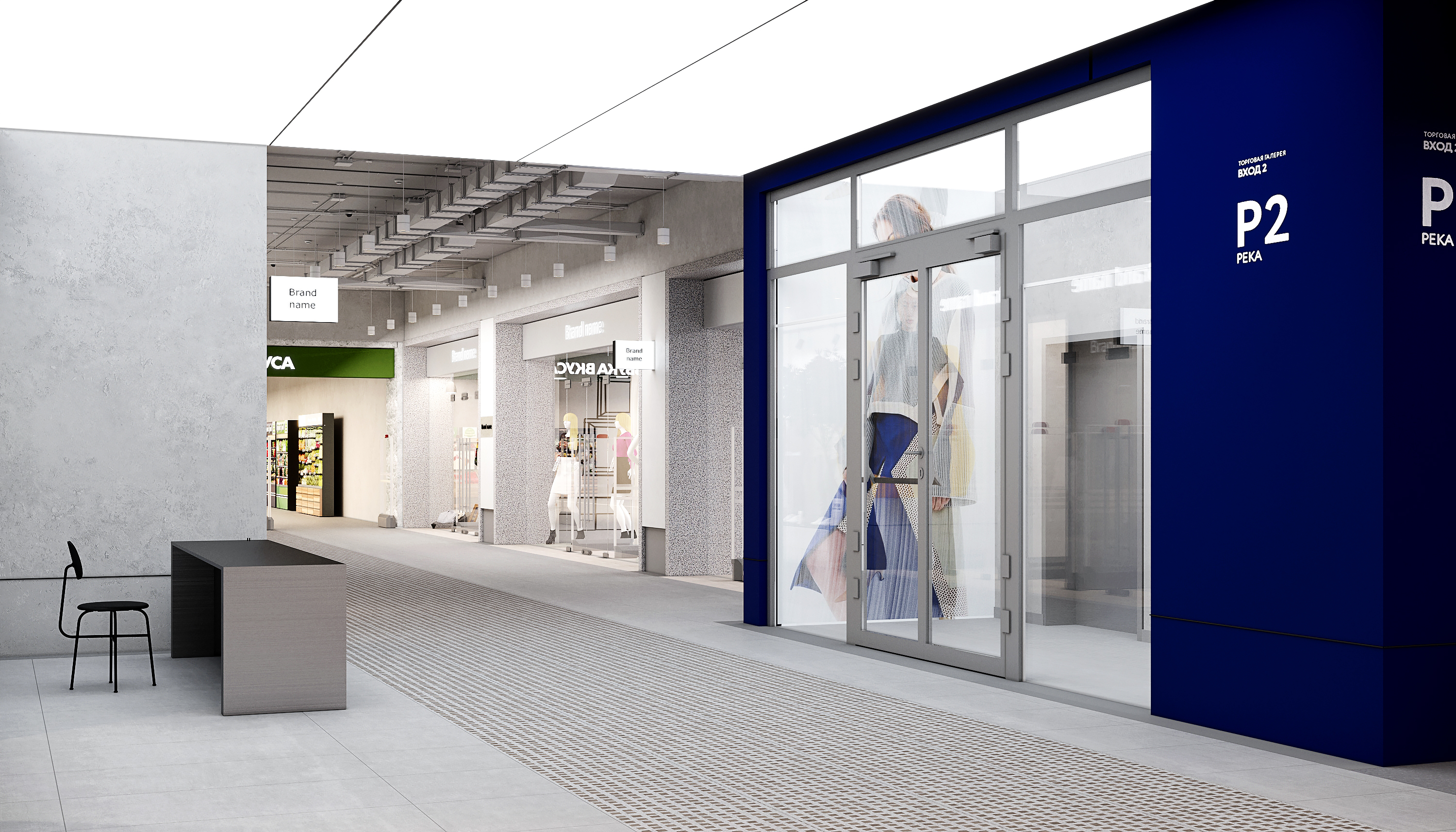
Wayfinding for visitors is developed with the signs, graphical design and colours. We added vibrant brandbook colors into interior to highlight parking, exact areas and utility rooms.
The color of the brand (Neglinnaya gallery) is neon blue which was accentuated by adding some charisma. Resume:
Our goal was to create a memorable environment and the design language by evoking classical traditions in a new way.
I am looking for likewise brave people who like to experiment and share their innovative ideas. If you feel attracted by the atmosphere of my concept I welcome any form of collaboration. You are invited to follow this link: www.kateturbina.works!
Enjoy!
Architecture, design, management.
info@kateturbina.works
www.kateturbina.works
Praça Marquês de Pombal 14, 1250-162 Lisboa
kateturbina.works © 2018–2025
